Component Guide III: Displays and Controls
Numerus includes several different display and control components for displaying output and specifying input. These include Tables, Line Graphs, Scatter Charts, Bar Graphs and Histograms (display); and Sliders, Spinners and Toggles (control).
Features
- Adding a display or control
- Find the component in the Displays and Controls list on the left side of the design frame. Press and drag the component onto the design canvas and release the mouse.
- Continuous vs. Complete Plot
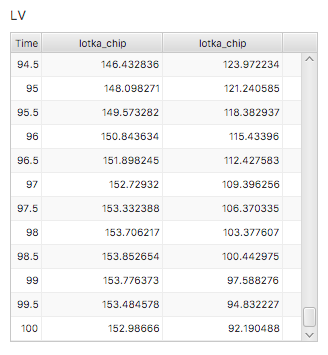
- All displays provide the option of Continuous Plot (data is displayed continuously throughout the simulation) or Complete Plot (data is only displayed at the end of the run). In the case of Continuous Plot, a Plot Frequency is also be specified. The Plot Frequency gives the number of time steps between plots.
- Pinning
- If a display/control appears in a submodel it is usually not included in the runtime canvas. However, if that submodel is used in a chip and pinning is selected, the component will be appear in the runtime canvas. If a display/control is used in an aggregator it will not be part of the runtime; the alternative is to use input and output pins to connect displays and controls to the aggregator's contents.
- Multi-controls
- If multiple instances of a chip is required with each instance having a unique input value, a multi-input control may be used instead of pinning the control and having individual control instances to accommodate all of the chip input. A multi-control is single control with a list containing all of the chips. To set the input for specific chip select that chip from the list and adjust the control accordingly. This approach avoids the clutter of too many input devices and organizes them by function.
- Saving Data
- Data may be saved from any displays to a comma- or tab-separated list [1] File names used for saving data should be specified before the first run using the File | Save Data As ... menu item. After each run, selecting File | Save Data causes the data to be saved to the file as specified, with numerical "_xx" sequence number appended to the end of the filename (so that separate runs can be easily saved).
Line Graph
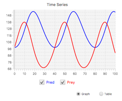
A Line Graph display is used to display results of a simulation over time. A Line Graph has the capability to display multiple series / variables simultaneously. You can also compare the results of different simulations on the same graph.
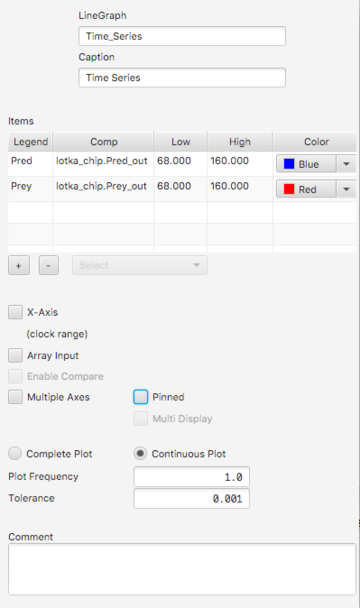
Properties
- Caption. This text appears with the graph at runtime.
- Items. Table showing the items to be graphed. These can include any value-producing element (component or output pin). To add an item click the + button and either right-click the item or select it from the selection list. To delete one or more items, click the item(s) (using the shift key for multiple selections) and then click the - button.
- X-Axis. By default the X-Axis is full time interval of the simulation. An alternate range can be specified by providing low and high endpoints.
- Array Input. If this is selected, the last entry in the Items table is treated as an array, with each array element treated as a separate data stream. The array dimension must be provided.
- Enable Compare. If only a single item appears in the Items table this may be selected. If so, each run of the simulation until a reload is executed will produce a separate plot on the graph.
- Multiple Axes. If selected, the low and high values of each item will separately determine extents for different y-axes. Otherwise only the lo/hi of the first item is used. If axis entries are omitted the graph will re-scale as needed.
- Multi Display. If the graph is pinned, and Multi Display is selected, streams from all chip instances will appear on a single graph.
- Tolerance. If Tolerance is greater than 0, it determines the precision of the plot, possibly reducing the number of individual points plotted.[2]
Note: At runtime you may select Table View to view the data in table form. Switching between graph and table view is not restricted in any way.
Scatter Chart
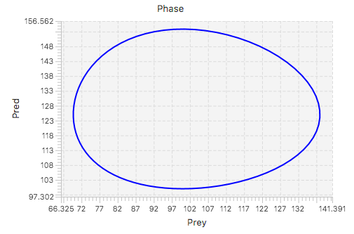
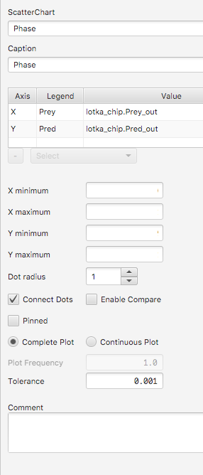
Each entry in a Scatter Chart uses an <x,y>, input pair to plot a point on the x-y axis.
|
Properties
|
|
Bar Chart
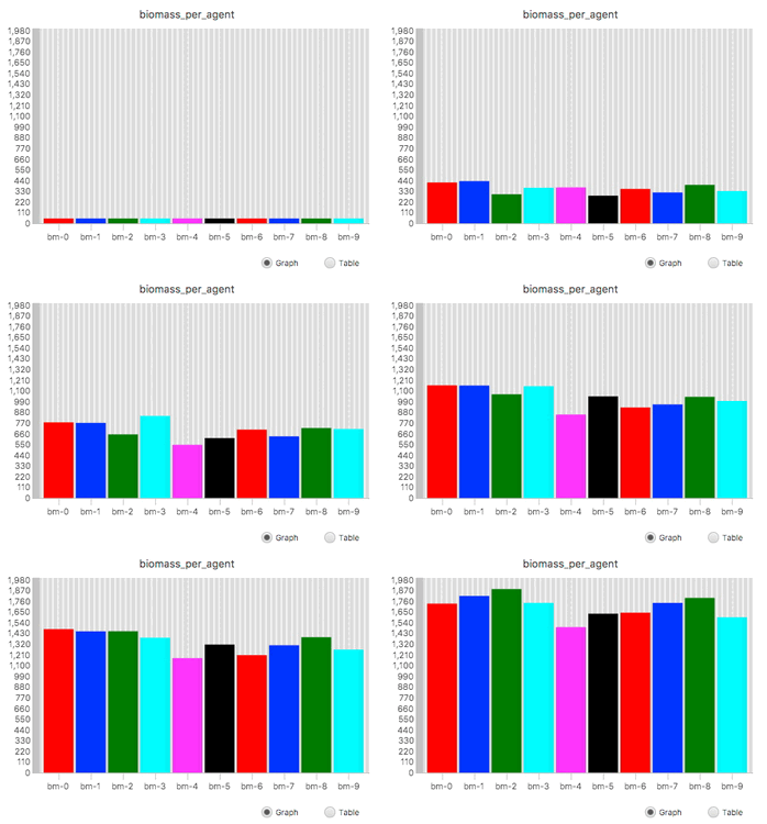
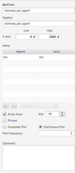
The bar chart accepts 1 or more inputs (or an array of inputs) and shows the current values of those inputs as a bar graph.
|
Properties
|
|
Histogram
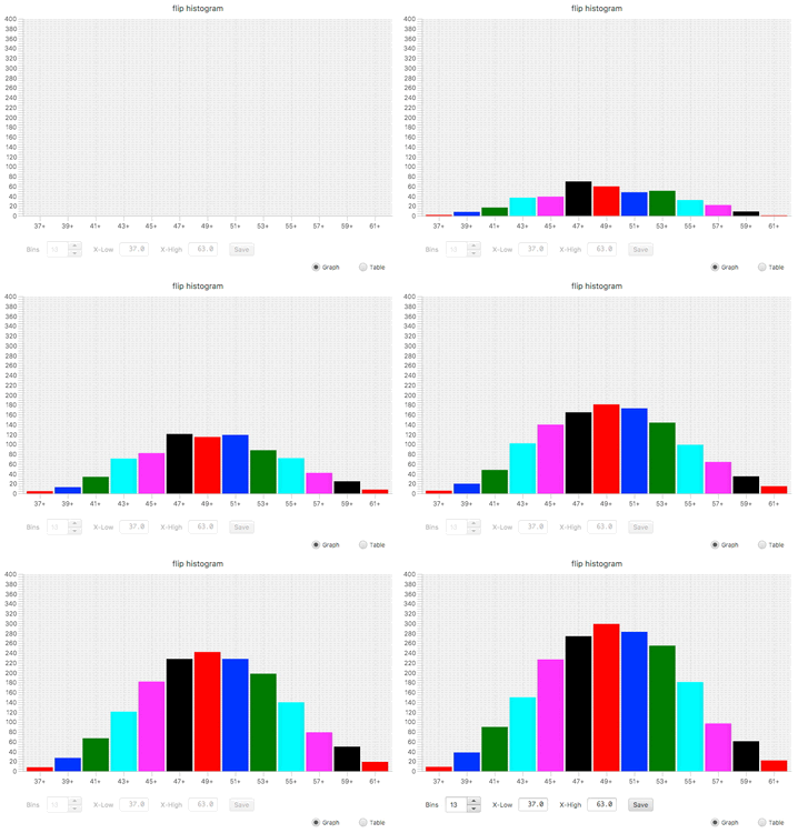
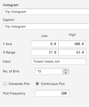
Displays a histogram of data accumulated as the simulation progresses.
|
Properties
Note: X Range and No. of Bins represent initial values only. These can be changed using controls on the runtime canvas. |
|
Table
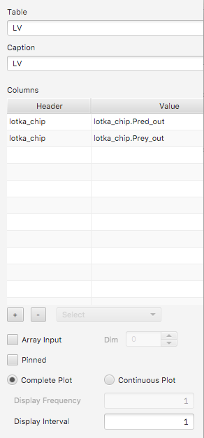
A table renders one or more data streams in tabular form.
Properties
See Line Chart for a description of other properties. |
|
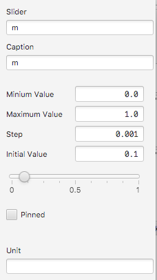
Slider
Sliders can be moved using the mouse or using arrow keys to obtain finer control.
Spinner
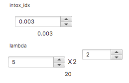
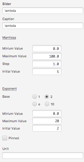
A spinner can either duplicate the functionality of a slider, as in the first example below, or provide input specified using scientific notation, as in the second.
Properties
|
|
Toggle
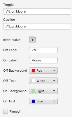
A toggle is a convenient 0-1 input.

PropertiesToggle properties determine initial value and detail labels, background color and text color. |
|
Notes
- ↑ Choice of comma or tab is respectively determined by the .csv or .tsv extension.
- ↑ Graph simplification uses the Ramer-Douglas-Peucker algorithm.
